Frontend GUI
Theming
The theme can be used to adapt the configurator to your CI to meet the design aspects. You can change the colors, the typography and much more. Under the hood, the configurator uses the Material-UI.
Theme provider
The ThemeProvider is located in the following directory:
src/Custom/App/Screens/Configurator/ThemeProvider.js
Note
This is optional and only needs to be done if the theme needs to be customized, the configurator is delivered with a default theme. If only the Theme Highlight Color, Theme Font or Client Logo needs to be adjusted this can be done in the adminarea Theme.
ThemeProvider structure
A theme provider always consists of a customTheme and an overrideTheme. These two definitions are passed to the
ConnectedThemeProvider.
import * as React from 'react';
import ConnectedThemeProvider from '@configuratorware/configurator-frontendgui/App/Screens/Configurator/ThemeProvider';
import merge from 'lodash/merge';

const customTheme = {
};

const overrideTheme = (theme) => {
    merge(theme.overrides, {
    })
};

export default ({ children }) => <ConnectedThemeProvider
                                    customTheme={customTheme}
                                    withTheme={overrideTheme}>
                                        {children}
                                 </ConnectedThemeProvider>;
To use the ThemeProvider, it must be passed to the ConnectedConfiguratorScreen in the Screen.js.
import * as React from 'react';
import CustomThemeProvider from './ThemeProvider';
import { ConnectedConfiguratorScreen } from '@configuratorware/configurator-frontendgui/App/Screens/Configurator/Screen';

export default props => (
    <ConnectedConfiguratorScreen
        {...props}
        ThemeProvider={CustomThemeProvider}
    />
);
To use the ConnectedConfiguratorScreen, it must be passed to the src/Custom/CustomApplicationConfiguration.js:
import ConnectedConfiguratorScreen from '../Custom/App/Screens/Screen';

const customApplicationConfiguration = {
    //...

    const customApplicationConfiguration = {
    screens: {
        Configurator: ConnectedConfiguratorScreen,
    },
};
customTheme
In the customTheme, general stylings such as colors,
fonts, etc. can be defined. This can be done either globally or separately for each rendered component.
In the following example are global colors defined within the palette node:
const customTheme = {
    palette: {
        primary: {
            light: '#ffffff',
            main: '#005091',
            dark: '#009166',
        },
        secondary: {
            main: '#d9d9d9',
        }
    }
}
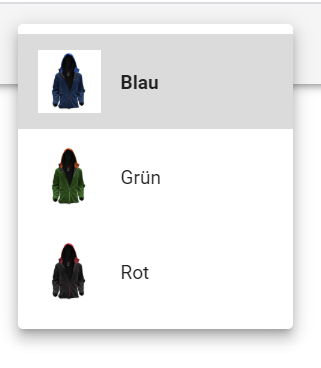
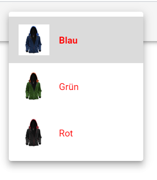
To override styling of components, this must be done inside the override node. In the following example we change the font color in the variant selection (drop down in the header):
const customTheme = {
    overrides: {
        VariantChooser: {
            VariantList: {
                '& span': {
                    color: '#ff0000'
                }
            }
        }
    }
}
Note
The configurator components can be found in the node_modules, in the package: redhotmagma-configurator-frontendgui,
under src/App/Screens/Configurator/Components.
Each component contains defined classes, in const styles and all these classes can be adjusted in the custom theme.
overwriteTheme
In the overwriteTheme you can make stylings, which are not available initially when setting the customTheme. An
example would be to set stylings dependent on CSS breakpoints to be able to adjust the styling for different display sizes.
import merge from 'lodash/merge';

const overrideTheme = (theme) => {
    merge(theme.overrides, {
        DefaultLayout: {
            visualization: {
                [theme.breakpoints.only('xs')]: {
                    top: 37,
                    bottom: 51,
                    height: 500,
                }
            }
        }
    }
}
Customizing
Find the configuration file under: src/Custom/CustomApplicationConfiguration.js. It contains several const to customize the configurator.
If you do not have your own custom project and are using the bundled version of the frontend, you can customize all of these settings in /public/configuration.js.
const prod = process.env.NODE_ENV === 'production';

const envDomains = {
    test: '',
    int: '',
    local: '',
    prod: '',
};

const domain = envDomains[prod ? 'prod' : 'int'];

const query = new URLSearchParams(location.search);

const adminMode = query.get('_adminmode');

const customApplicationConfiguration = {
    network: { //... },

    openConfigurator: { method: WidgetAfterSaveMethods.OpenNewWindow },
    defaultLoadIdentifier: false,
    loadVariantsFirst: false,
    showInitialOptionclassification: false,
    showStartHere: true,
    showAddToCartButton: true,

    language: false,
    locales: [{ code: 'de_DE', preferred: true }, { code: 'en_GB' }],

    saveTypes: SaveTypes,
    customTitleSaveTypes: [SaveTypes.DESIGNTEMPLATE, SaveTypes.INSPIRATION],
    editCustomTitleBeforeSave: false,
    loadInspirations: false,

    availableTools: {
        fastConfiguration: false,
        save: true,
        load: true,
        share: true,
        print: true,
    },
    displayAcceptDesign: true,
    showAddToCartButton: true,
    validateBeforeAddToCart: false,
    dock: false,
    addToCartMethod: 'postMessage',
    restrictAmountselectionToSelectedVariant: false,
    displayColorAmountWarnings: true,
    displayEditorRulers: true,

    visualization: { designAreaHighlightBackgroundColor: 'transparent' },
    designer: { dpi: 300 },

    displaySwitchedOptions: false,
    checkOptionclassificationOnSelect: false,
    optionclassificationCarousel: true,
    disableBeforeunloadWarning: false,
    hideOptionListOnAwayClick: true,
    optionDetailsWithImage: false,
    fixedOptionlist: false,
    optionlistDialogPositioning: {
        left: [['left', 'right'], ['top', 'top']],
        bottom: [['center', 'center'], ['bottom', 'top']],
    },
    optionListFixedToLeft: true,
};

setConfiguration(customApplicationConfiguration);

export default customApplicationConfiguration;
envDomains
Specify different environments for the api here.
const envDomains = {
    test: 'test.redhotmagma.de',
    int: 'int.redhotmagma.de',
    local: '127.0.0.1:8080',
    prod: 'www.redhotmagma.de',
};
customApplicationConfiguration
Network
There are several sub paths that can be specified separately in the network section:
const customApplicationConfiguration = {
    network: {
        host: domain,
        baseURL: `${domain}/frontendapi/`,
        adminBaseURL: `${domain}/api/`,
        resourcesURL: `${domain}`,
    },
};
Initialization
const customApplicationConfiguration = {
    // default options for opening the configurator (eg. after saved from the calculation widget)
    openConfigurator: {
        method: WidgetAfterSaveMethods.OpenNewWindow,
        // when the PostMessage mode is used the targetOrigin can be specified, otherwise '*' will be used
    },
    // override this to set a default item identifier to load if not defined in the route
    defaultLoadIdentifier: false,
    // set true to load available variants before loading the configuration
    loadVariantsFirst: false, // default: false
    // set true to open the first optionclassification instead of the "start here" text
    showInitialOptionclassification: false, // default: false
    // show the "start here" animation
    showStartHere: true,
    // show the "add to cart" button by default
    showAddToCartButton: true,
};
Internationalization
const customApplicationConfiguration = {
    // the default language code (format: de-DE, en-GB, etc.), use false to select the browser language
    language: false,
    // the available locales
    locales: [{ code: 'de_DE', preferred: true }, { code: 'en_GB' }],
};
Controls
const customApplicationConfiguration = {
    // available tools in the toolbar
    availableTools: {
        fastConfiguration: false,
        save: true,
        load: true,
        share: true,
        print: true,
    },
    // set true to show accept design checkbox approval
    displayAcceptDesign: true,
    // show the "add to cart" button by default
    showAddToCartButton: true,
    // set true to run server-side validation before addToCart
    validateBeforeAddToCart: false, // default: false
    // set false to decide by screen orientation, or can be fixed 'left' or 'bottom'
    dock: false,
    // define javascript method to call on addToCart
    // Second option: 'functionCall' will call window.parent.addToCart(configuration.code)
    addToCartMethod: 'postMessage', //  default: 'postMessage'
    // if set to false only the amount for the currently selected variant can be selected
    // when switching the variant the selected amount is transferred to the newly selected variant
    restrictAmountselectionToSelectedVariant: false,
    // show warning if on switch of production method color amount will not fit anymore
    displayColorAmountWarnings: true,
    // show rulers in edit mode
    displayEditorRulers: true,
};
Visualization
const customApplicationConfiguration = {
    visualization: {
        designAreaHighlightBackgroundColor: 'transparent',
    },
    designer: {
        dpi: 300, // the default canvas dpi as project specific option
        maxColorAmount: 10, // the default max number of colors in the colorizing feature

        // the image formats users can upload to designareas / designer items
        allowedImageUploadFormats: 'jpg,jpeg,svg,png,pdf,bmp,tif,tiff,eps,ai,gif',
    },
};
Options
const customApplicationConfiguration = {
    // set true to display the selected option for each optionclassification
    displaySwitchedOptions: false, // default: false
    // set true to check the optionclassification immediately after selected
    checkOptionclassificationOnSelect: false,
    // use carousel for optionclassification list
    optionclassificationCarousel: true,
    // set true to disable beforeunload warning
    disableBeforeunloadWarning: false,
    // set true to hide optionlist when user clicks somewhere else
    hideOptionListOnAwayClick: true,
    // set true to force the option details dialog shown with an image
    optionDetailsWithImage: false,
    // set true to disable optionlist moving
    fixedOptionlist: false,
    // relative position of the option list dialog
    // [
    //   [<dialogSideH{left|center|right}>, <relToSideH{left|center|right}>],
    //   [<dialogSideV{top|center|bottom}>, <relToSideV{top|center|bottom}>]
    // ]
    optionlistDialogPositioning: {
        left: [['left', 'right'], ['top', 'top']],
        bottom: [['center', 'center'], ['bottom', 'top']],
    },
    // should the option list be fixed to the left side, or it can open up above the selected option classification
    optionListFixedToLeft: true,
};
Save Types
Save types are stored in the database in table configurationtype. They need to be aligned here in frontend for saving the configurations with the correct type.
const customApplicationConfiguration = {
    // which types need a custom title before saving?
    // array of configuration save types
    saveTypes: SaveTypes,
    customTitleSaveTypes: [SaveTypes.DESIGNTEMPLATE, SaveTypes.INSPIRATION],
    // show custom title input before saving the configuration
    editCustomTitleBeforeSave: false, // default: false
};
Extending functionality
If a handling in the configurator should be extended, you can define your own reducers for this purpose.
These can listen to the events defined in node_module redhotmagma-configurator-frontendgui and extend them at the
necessary places.
Note
next state to see which reducers are available and can be extended. All first level states, such as configurator, can be extended.redhotmagma-configurator-frontendgui. Reducers can be created under the following directory: /src/Custom/App/Reducers/./src/Custom/App/Reducers/Configurator/Reducer.js
A reducer always contains the following basic structure:
import configuratorReducer
from 'redhotmagma-configurator-frontendgui/App/Reducers/Configurator/Reducer';

export default function (state, action) {
    return configuratorReducer(state, action);
}
To use the now created reducer, it must be defined in the CustomApplicationConfiguration.js in the customApplicationConfiguration configuration:
import customConfiguratorReducer from '../Custom/App/Reducers/Configurator/Reducer';

const customApplicationConfiguration = {
    // ...
    reducers: {
        configurator: customConfiguratorReducer
    },
// ...
};
Now we have set the base to extend the configurator Redux state.
First we have to find the right action we want to get into. We can find this out via the console of the browser,
as already described in the note above. In our case we use the action DesignData/SET_CANVAS_DATA.
In the configurator reducer we can now define the following to listen to the requested action:
export default function (state, action) {

    switch (action.type) {
        case designDataActionTypes.SET_CANVAS_DATA: {
            // ...
        }
    }
    return configuratorReducer(state, action);
}
Within the case block we can now implement our custom handling and add a new node to the state. In our example we set the letterAmount in the text object:
import get from 'lodash/get';
import immutableSet from 'redhotmagma-configurator-frontendgui/Utils/Immutable/set';
import configuratorReducer
    from 'redhotmagma-configurator-frontendgui/App/Reducers/Configurator/Reducer';
import {actionTypes as designDataActionTypes} from 'redhotmagma-configurator-frontendgui/App/Reducers/DesignData/Actions';
import {letterAmount} from './Selectors';

function updateLetterAmount(state, action) {
    const { designAreaIdentifier } = action;

    const objectsPath = `configuration.designdata.${designAreaIdentifier}.canvasData.objects`;
    const objects = get(nextState, objectsPath, []);

    return immutableSet(
        state,
        objectsPath,
        objects.map(object => {
            if (object.type === 'Text') {
                return {
                    ...object,
                    letterAmount: letterAmount(object)
                };
            }
            return object;
        })
    );
}

export default function (state, action) {

    switch (action.type) {
        case designDataActionTypes.SET_CANVAS_DATA: {
            // get the original state first
            const nextState = configuratorReducer(state, action);
            // call the customizer function, which should always return the next state object
            return updateLetterAmount(nextState, action);
        }
    }
    return configuratorReducer(state, action);
}